 |
| oil on linen panel, 7x5" / unframed /sold |
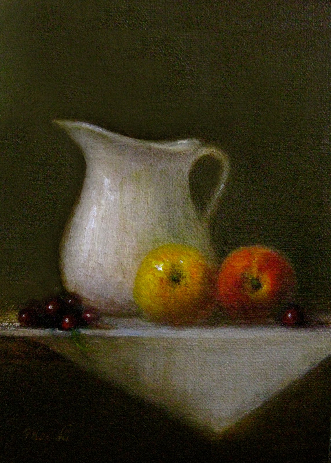
On the left you'll notice a clump of cherries. They were painted in one mass. With some warmed alizarin and a few strategic highlights, I made some of the cherries pop. Not every cherry was been painted to allow you, the viewer to use your imagination! My intention was also to keep the cherries a mass to call as little attention to them as possible-keeping them as part of the background so that your eyes stayed focused on the peaches.
The pitcher and yellow peach are very close in value (degree of lightness or darkness). To make the pitcher recede, I cooled the white. I warmed the yellow peach with a bit of orange added to the yellow to make it come forward. To further hold your eyes on the peach and not the pitcher, I added a highlight on the peach. Test this out by closing your eyes, and then opening them. Where did your eyes look?
To enhance your viewing pleasure of Peaches and Cream, may I suggest pairing it with my recipe, Peach Cobbler featured in my for and wellness blog.

To enhance your viewing pleasure of Peaches and Cream, may I suggest pairing it with my recipe, Peach Cobbler featured in my for and wellness blog.
How this painting will look framed:

2 comments:
Gorgeous painting. Looks good enough to eat.
Beautiful edges and great color saturation on the fruit!! Lovely.
Post a Comment